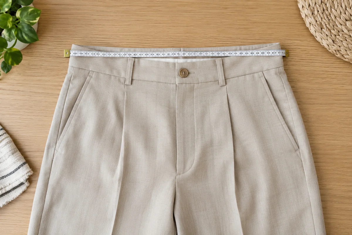
Start with a favourite
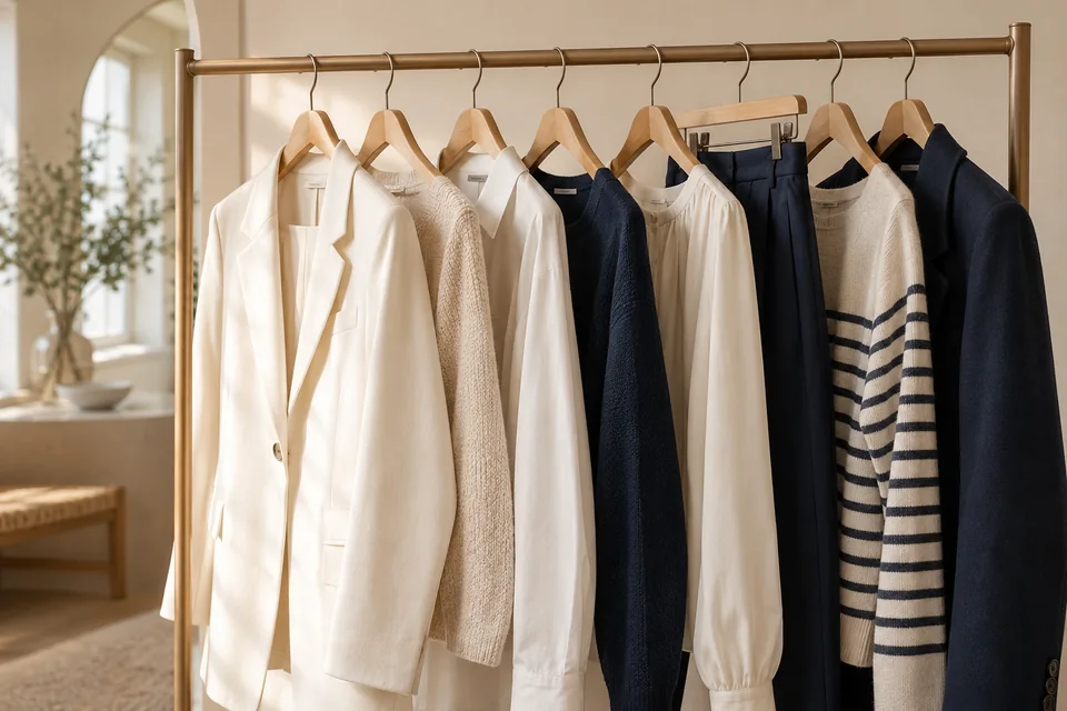
Choose a garment colour you enjoy and place two others beside it. Notice strong contrast, soft harmony or a single accent. Seasonal colour analysis is not required to begin.
Limit while experimenting
Try two main colours and one accent, photographing in daylight. Shoes and accessories can repeat or deliberately contrast. This is an exercise, not a permanent colour limit.
Check your context
Try the whole outfit and view it from a distance. An image palette may look different worn, in other light or near your face. Keep combinations you like and change one element at a time.
A practical example
With blue trousers and a cream top, compare a brown accessory with a pink one. Look at both complete outfits instead of declaring a colour forbidden. Keep the combination you want to wear.
Use your actual clothes
Compare two tops with the same bottom in similar light. Assess colour, contrast, texture and visible proportions together. Screens do not always reproduce fabric; unfiltered photos are aids, not verdicts.
Compare visible proportions
Include shoes and outer layers in reference photos. A colour barely visible sitting may dominate standing or without a jacket. Compare actual visible proportions rather than equal fabric samples.
| What to examine | Practical check | Useful decision |
|---|---|---|
| Starting point | An item you already wear | Use its colour as a reference |
| Contrast | Try two items together | Choose the intensity you enjoy |
| Accessory | Small addition to the actual outfit | Assess before a larger purchase |
Your checklist
- Choose a starting colour
- Try one accent
- View the complete outfit
Frequently asked questions
Must I follow my colour season?
You may use it as vocabulary, not an obligation or judgement on colours you enjoy.
Ban colours outside a palette?
No. Palettes are creative tools, not requirements.
Sources & references
This method is an editorial suggestion to adapt to your taste, budget and everyday life. It is not based on product tests or brand rankings.